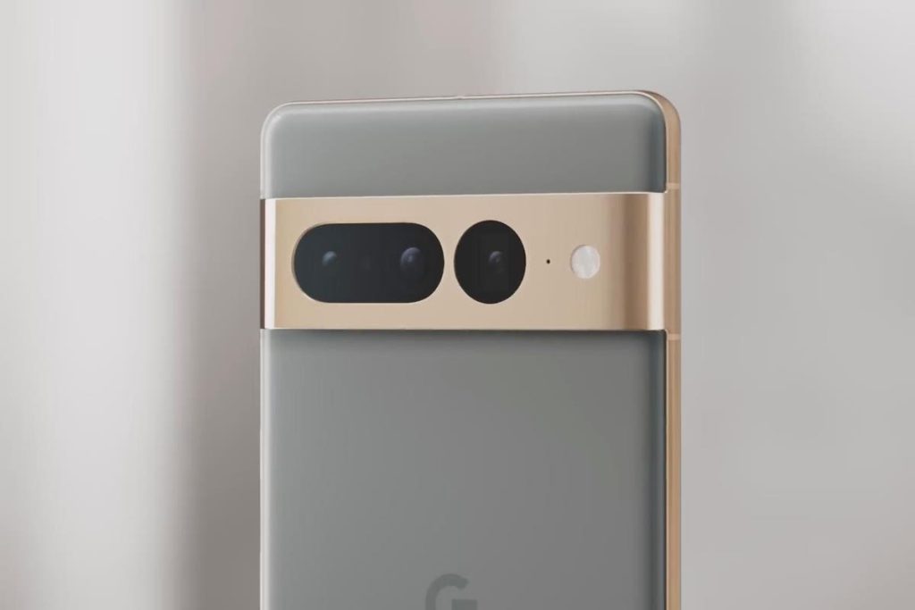
Google’s soon-to-be-released Pixel 8 and Pixel 8 Pro smartphones are set to receive a radical camera revamp, according to a new report.
Citing hands-on experience from an unnamed Google insider, Android Authority reveals several changes to the built-in camera app that set it apart from the version currently available on the rest of the Pixel range — and I can see why nearly all of them make sense.
Perhaps the most obvious of these changes is a new switch at the bottom of the screen that allows you to toggle quickly between photo and video modes by selecting the appropriate still camera or video camera icon. Placing this control in its own space at the bottom of the screen means the toggle is always available without having to swipe through a longer carousel of options to locate and select these two fundamental modes.
The change also gets rid of the confusingly named “camera” mode, which is currently used to take still photos. Technically, all modes in the camera app are “camera” modes, including video mode, so this is a very welcome clarification, in my opinion. Now, when toggling between photos and video, the modes are clearly labeled “Photo” and “Video” instead.
Other changes have less obvious advantages, such as the decision to swap the positions of the button that switches between front and rear cameras with the button to enter the gallery preview, the latter now appearing on the left of the screen instead of on the right. I can see no real reason for this change other than that it brings Google’s camera app in line with most other smartphones I’ve used, which also place the gallery preview button on the left.
Additionally, the camera settings menu is now accessed by swiping up from the bottom of the screen rather than down from the top. The settings button has also been moved right down to the bottom of the screen. Moving controls to the bottom of the screen in this way, should make them fall more easily under the thumb when taking photos, especially when using the phone one-handed such as when taking a selfie. Unfortunately, the report claims the settings menu itself is no easier to reach once it has been activated by swiping up.
The Pixel’s ‘Long exposure’ and ‘Action pan’ options now have their own more-prominent entries in the carousel instead of being tucked away under the ‘Motion’ menu item, which has now been removed. Like the ‘Camera’ option mentioned above, a menu item titled simply ‘Motion’ doesn’t provide much information about what it does. I think the new, more descriptive options are, therefore, more likely to actually end up being used. The silent, slow-motion ‘Cinematic Pan’ option from the video stabilization menu has also been given its own entry in the main options carousel. This is a sensible change too, as it’s a valid feature in its own right and definitely not an effect you would want to enable unintentionally when trying to find the best stabilization option for regular video.
While changes to a familiar interface will always cause confusion for some, I can see how (most of) these changes make sense and will improve usability. A new product launch is also the perfect time to do it, alongside any new features Google is more than likely to add in the Pixel 8 range.
Follow @paul_monckton on Instagram
Read the full article here


