On January 17, 1890, the explorer and scientist John Wesley Powell testified to the U.S. Senate about the development of the western United States, and how water scarcity across that vast, mostly uninhabited land would limit what was possible in the future. To make his case, he used maps.
Powell was the most famous and influential scientist in the country, and head of the U.S. Geological Survey. His Senate appearance was significant enough that accounts of it were published widely. The stories say Powell presented the Senate with a map that was both extraordinary and radically innovative.
Powell titled the map, “Arid Region of the United States: Showing Drainage Districts.” It was a mosaic of color — the land area overlaid with carefully outlined splotches of green, pink, purple, blue, orange, brown. Each color represented a distinct watershed of the west, 22 in all. Powell had designed the map to tell a story — to show how dry the west was compared to the east and to illustrate the region’s complicated, often dramatic variations in terrain, precipitation, rivers, and streams.
At the time, according to Powell biographer John F. Ross, the map was as arresting as the iconic “Earthrise” photograph taken from the Moon a century later by the Apollo astronauts.
Powell’s map was ahead of its time — a map combining environmental, geographic, and human information not just to tell a story, but to make an argument: The American West is a desert. Let’s develop it with care.
The map had one more innovative quality: It predicted the future. It foretold the Dust Bowl of 1930 and the withering of the Colorado River in 2023.
John Wesley Powell knew something about the creative power of maps in the 19th century that we are rediscovering in the 21st.
We’ve gotten used to a new kind of map in the last decade — a map that does much more than show a slice of geography.
We tell our phones where we want to go, they provide turn-by-turn directions. They tell you with remarkable accuracy what time you’ll get to your destination. They essentially predict the future of your drive.
We touch the weather app and can instantly see advanced radar imagery of storms coming in. Your weather app’s screen has a little-noticed function: It will show you radar imagery for the last hour or two. It will also show you radar imagery for the next hour or two, using computer modeling. It will predict the future of your weather.
Maps are the original data visualization tool. Going back 25 centuries, maps have shown what the seacoast looks like, where fortifications are, where the taxable property is.
But the last 10 years — really, just the last 5 years — have given maps a whole array of new powers. Today, asking what can a map do? is like asking what can a satellite do? or what can a computer do?
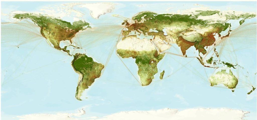
Maps can show us our world in ways we have never seen it before. They can snap into focus both problems and solutions. Maps can show us the future we’re facing, bad or good, then guide us to avoid perils and create a better future.
Here’s a simple question: Where are the gaps in broadband internet coverage in the U.S.?
It’s not that difficult of a question to answer. We can quickly make a map of current broadband internet connectivity — down to the level of a city block, a suburban subdivision, a rural highway — and see where it’s missing.
That would be a useful map for sure but it wouldn’t answer the most critical question: Where are the broadband gaps that impact people? That is, where are the places people live but don’t have access to broadband?
We can take that map of broadband access and broadband gaps, and layer on population – demographics by race and age, by income and household size. We add schools and public libraries —places that need high-speed internet and can provide it to others. We could even layer on data about who has smart phones because it may be quicker and cheaper to bring in high-speed internet using wireless networks.
Now you have a map that shows not just where high-speed internet access is missing, but who is disadvantaged by the gap. It’s a map that quickly answers two urgent questions: Who doesn’t have broadband but needs it — like neighborhoods with many school-age children? And if you’re going to spend $1 million or $100 million to fill the connectivity gaps, where can you get the most impact for the money? You can even begin to answer the question, how should we build out the network?
That kind of map changes the idea of what a map really is.
Ten years ago, it would not have been possible to make a map like that. Even five years ago, assembling those data layers might have taken days or weeks. Now, because of modern geographic information systems (GIS) technology, this map can be created in minutes. It can be shared. It can be updated in real time. It can have storytelling simplicity to make it accessible and engaging to anyone in any community. At the same time, it can have the detail and precision necessary for the engineering staff of a telecommunications company.
In fact, just as all kinds of information, data, and tools are now instantly available on the internet, sophisticated base maps are also now available — often with detail down to the individual street and city-block levels, including a massive set of ready-made maps called the Living Atlas of the World.
What if you want to build a network of electric-vehicle (EV) charging stations? You want to know where existing stations are located. You want to know where EV owners live. Where they work. What roads they travel. You want to know where likely EV purchasers live.
If you’re in the US, you also want to tap into the new federal government Inflation Reduction Act, which offers money for building EV charging networks. Forget reading pages of the requirements to qualify for those subsidies and trying to match them to your market. You can program the requirements right into the map, which will show which geographies qualify. Then you can instantly see the overlaps between your customers and the subsidies.
Or you could build the map the opposite way: Start with the communities that qualify for charging-station dollars and see how those places match a business model and a customer base.
As recently as 2015, it would have taken months of marketing and demographic research to try to answer those questions. And the resulting PDF map might have been out of date before it was finished.
Now, a smart map fills those information gaps. It can be created in less than an hour. It can be continuously updated with fresh data on EV sales, on the traffic patterns of EVs, on evolving rules for government subsidies.
What’s more, it’s a map that can tell you what might happen in the future. A community that wants more charging stations could use a map like that to put the right incentives in place to spark their installation.
It’s not just that maps have become a framework for assembling all kinds of data. Maps now have speed. They can be made quickly, without losing detail, reliability, or authority.
That means decisions on how to tackle problems can be made more quickly too, because we’re not waiting weeks or months just to understand a problem.
It’s astonishing to have a familiar tool — a map — become so powerful, so insightful, so adaptable.
Maps are a common and timeless language. We can look at maps made 100 years ago or 1,000 years ago and understand them.
They give us a way to care for our environment, manage the economy, plan for the future — whether we are focused on cities, companies, or entire countries.
Last fall, the Biden Administration rolled out an example of exactly this kind of problem-solving map. It’s called CMRA, Climate Mapping for Resilience and Adaptation. CMRA can show how vulnerable any location in the U.S. is to the impact of climate change — drought, flooding, wildfires, extreme heat. It layers on data about people by age and race and population density. It layers on infrastructure that might be in the path of climate disasters — right down to street level. It shows what has actually happened in the past at every place in the U.S.
CMRA is quickly becoming a core piece of U.S. infrastructure — vital for zoning and development decisions, for thinking through how to spend resilience money or site new cell phone towers, for planning emergency response to everything from the kind of wildfires that have devastated Maui to the next hurricane season.
CMRA is free. It’s open and constantly updated. The data behind it is available to local officials, businesspeople, experts, and academics who want to build their own tools. And CMRA uses modelling to show the future, telling executives, city leaders, or first responders what might happen in 2025 or 2035.
CMRA is a map that’s understandable to anyone of us. But to call it a map is like calling the internet a set of connected data cables. A similar mapping effort, the Global Climate Geodesign Challenge, is underway to reduce human-generated carbon emissions while protecting and enhancing globally critical ecosystems. These are really tools for mapping the future; for creating thriving communities, resilient infrastructure, flourishing ecosystems, and a prosperous economy.
That’s what John Wesley Powell understood about the power and utility of maps when he first presented a map of the west to the Senate in 1890. Maps are dual purpose. They are eminently practical, but they are also aspirational. We need maps to understand what is, but also to imagine what could be.
Join Washington Post Live on Wednesday, September 20 to hear from Esri President Jack Dangermond on how modern maps reveal solutions to climate hazards in a segment presented by Esri. Register here.
Read the full article here


